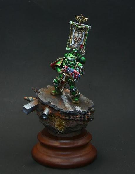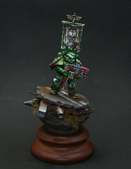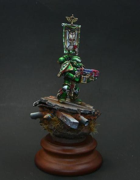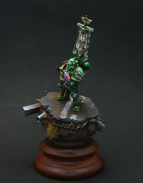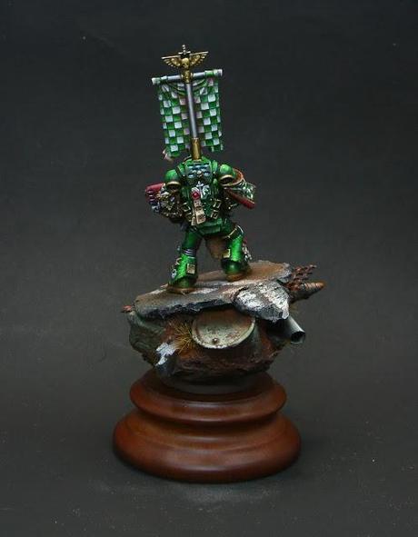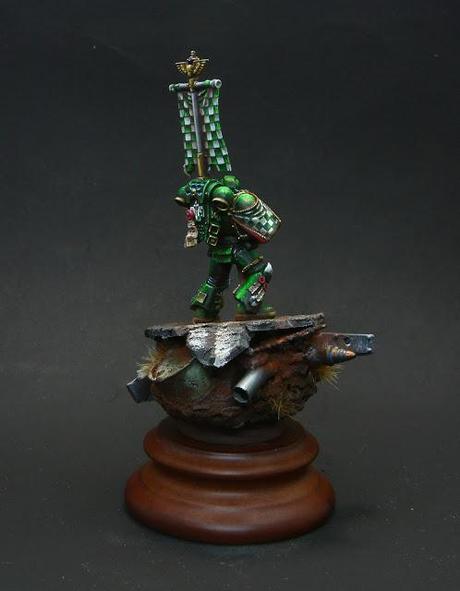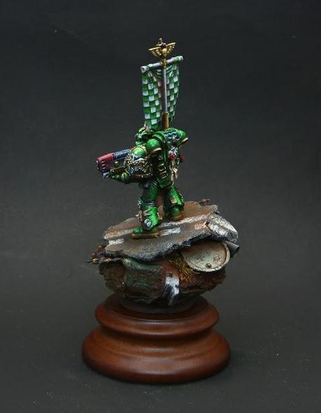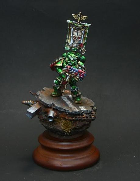
He has been with me in this year's contest period and has got some awards: bronze on The Moscow Spring Angel, gold on Moscow Crystall Hummer and Bronze Demon on USA Golden Demon!
So here is his birth's story.
Prepearing.
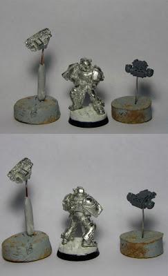
As usual, the first steps of the preparing miniatures are: the cleaning, nailing the feet and handsMy firs plan was to create an ordinary spacemarin, so the base was prepared perfectly simple. Only later, when I realized that the miniature will take part in the competition Spring Angel, I changed the base to a more respectable.
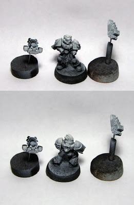
 Here are my general advices for the priming:
- If you have mostly bright armor, use a white or light gray primer
- If you have a dark armor, use a combination black and white primer.
I don't use the pure black primer, it desaturates colors, does it darker and you need to paint more layers to cover it.
In my case, the order is, of course, Dark Angels, in dark green armor, so my choice is - a combined version. At first the miniature completely was blow out in the black, then I did a few light puffs with a white primer from above - simulating zenith lighting
If you use that option - take a picture of primed miniature, it is a good clue to see the location of spots of light and shadows on the model. And you can use it when lightening / darkening of armor.
Coloristic - warning: a theory!
My advice is - to read my articles about colors for better understanding of this part. Especially these:Let's talk about color theory. Part 1: Goal setting. Let's talk about color theory. Part 5: Color "Temperature"Let's talk about color theory. Part 6: Contrasts (not ready yet) I'll start with goal setting. We have two focus points here - a face and a weapon. And we have a Dark angel color scheme. It's hard to come up with something new here except the light/dark contrast for face (plus quantity contrast for eyes) and the complementary contrast for weapon. And I have a secondary task - to create a volume on the miniature. Usually I use the light/dark contrast, of course: darker in the shadows, lighter - on the convexities. It's the most primitive and common way.
But I want to do it more interesting. Often I use a cold/warm contrast for shadows and highlights. But at first I have to decide two things:1. a temperature of miniature at all: cold (in the cold light) or warm (in the warm sunny light) tone2. shade and highlights have to made in opposite temperatures. So basing on the first point: in "cold scheme" I add cold colors for highlights and add warm colors for shadows. It will be opposite situation in the "warm" scheme. All parts of the miniature must match these two points to create the whole picture. Now I'll apply all this to our particular example.
In my case, the color of Dark Angels is green. I decided to paint it in a cold gamma. So I get a base color - GW Dark Angel green, add a cold GW Space wolf grey for a highlights and VMC Burnt cad.red + a bit of black for a shadows
I'm sorry, but a bit more theory: doing the warm reddish shade for the main green I use another one, a third type of contrast - simultaneous . This contrast based on the ability of our eyes which is the next: when we look at any color our eyes immediately require the appearance of its complementary color, and if there is none then simultaneous, ie at the same time, generate it (red and green - complementary colors that lie opposite on the color wheel). That is, of course, in life there are no red shadow is on this Space Marines, but our eye is trying to compensate for the green, so we see red shadows. That is what I try to draw.
Painting
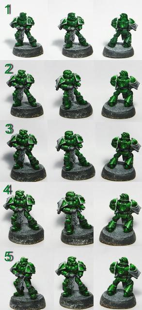
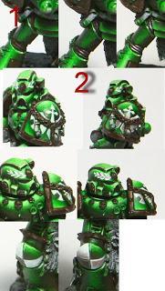
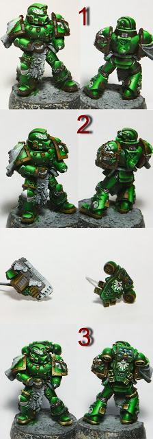
All my decisions I keep in my mind, take a brushes and start to work. And first thing is an armor, of course.My steps, according to numbers on the collage:1. base layer - GW Dark Angel green.
2. Highlights with the addition of GW Space wolf grey, some places (helmet, shoulder pads top, some of the faces) to pure GW Space wolf grey. The most tedious and difficult stage. Here you need to draw the "map" of coverage - where more where less glare and reflections form. Especially attention for this moments:- Not the same brightness everywhere, do not do the extra work. Bottom of miniatures in general should be a little lower in intensity than the upper part. It is very important to support the main goal - to generate more intense of lightening at the top. - Do not forget about the reflexes, they form the integrity of the miniatures. For example, the front surface of the armor panel on the lower leg (below the knee cap) is not lit at all, but it will take a light from the reflection of the highly illuminated toe shoe, which just lit strongly enough. And remember, that the reflexes are always darker than light, ie it is not bright glare, in theory it's slightly darker base layer, but brighter shade. Making an amendment to the scale miniatures and structure of the material (metal), you can make it a little brighter, but again, it must be much darker than the highlight.- And this is my way: I love to lighten stronger. Then I usually control the degree of light using glazes (it will be in section 5).3. Shadows - with the addition of black and VMC Burnt cad.red. That's why I do not like the pictures on a white background - for their eating of the colors in the shadows. I myself do not see red color on this collage but it' there. I hope that we'll see it on the final pics.
4. Ran over the miniature and painted the black corrugations, hoses, cracks, walked along the edges once again a mix from point 2, then GW Space wolf grey + VMC Silvergrey. I lightened the verge only those that are turned up.5. And I apply glaze to merge together all my contrast and smooth transitions. For this I used the VMC Glaze medium and GW Dark Angel green. Covered all the miniature with two layers. If you need somewhere to reduce the brightness, you can go a few more times.
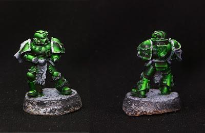
 Here is the pic with a black background. I see my red shadows!
 Details:
1. corrugations:
- filled the gaps with diluted red-brown, the color of my shadow that I used in armor
- restored black ribbed crown, then gray
- highlighted from gray to pure white
I know that the corrugations are supposed to be rubber, but I don't know how to paint the black rubber showily especially on such small surfaces. Therefore, I often sacrifice what should be in the name of prettiness, the rubber for the shiny glamour metallic
2. Order signs
- painted with white paint
- shaded gray, then gray + the same reddish-brown.
It's good to trace the outline by the dark (not black, but the color of the shadow armor, in this case, the dark green), and light - on the edge of the sign by white. This will give the picture sharpness.
 Gold NMM
I've used my old recipe for gold NMM:
1. All the surface is covered with dark brown with red taste. Previously it was Scorched brown, now I've used Rhinox hide.
2. GW Snakebite leather (new analogue has not picked up)
3. Further lightening with VMC Japan uniform (similar to the GW Bubonic brown), then white to almost pure white dots.
 Details -2 Red color: seals of purity, cover arms, etc. - I need it cold, so I've used a basic red which is a little shifted to the red-violet sector (rather than the red-orange) - Rakham 035 (may be analog GW Khorne red) Tint with white or Space wolf grey, with the addition of black shadows.
Scrolls were painted with VMC Flat earth - VMC Buff - VMC Silvergrey. Shadows - with the addition of red-brown.
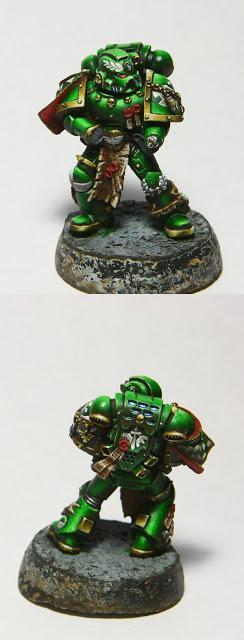 At this stage I realized that I really like this Spacemarin and it could be a little more finalize to get a "competitive" state. For this it was necessary to add more presentable base and a banner. I've found a banner and painted it with a typical picture of DA from new Codex, done scratches and chips all over the armor, painted the base - and the miniature is ready!Final pics: