Remember the first time you used Google Earth some 19 years ago? Yup, that's kinda like this. Except, now with all your personal Strava heatmap overlaid atop it. And yes, Google earth is really 19 years old. It was first released in June 2001 - some 8 years before Strava themselves came along. History lesson aside, this is not Google Earth, but rather, powered by Mapbox. In fact, I'm sure someone at Mapbox or Strava is face-palming that I'd even mention Google Earth. But hey, Friday.
To use it's super easy - assuming you're a Strava Subscriber. Though, it works best on a laptop/desktop - less so on a mobile device since it's not Strava's app, but rather their desktop site. Still, if you're determined enough - then go forth and hit up this link. Here's mine, starting with Amsterdam. This isn't new, but it's still fun to see every road or path I've ever ridden or run on, and then more lava when I ride that route more often.
Though, it's not limited to just running and riding. In fact, if I toggle satellite mode you can see my swims in the 'lake', and my ice skating in the rowing basin. You can use the various checkboxes and toggles at left (on above screenshot) to filter activities and such. The cool thing though is *ALL OF THESE ARE LINES MINE*, and mine alone. But again, we're not here for that.
Instead, we're here for this checkbox:
Click it! Click it real good!
And just like that, you learn the Netherlands is a pancake. A perfectly flat crepe. Not even the summit I repeated some 27 times shows up to become the Strava Local Legend. You can change from satellite view to not-satellite view, but it won't make the Netherlands any less pancakey.
So instead, let's go down to Chamonix, where I've got plenty of lines to make this feature halfway viable. And there we go, we can see all my red lines. Most are hikes and trail runs. Though some are skiing, and a few mountain and road rides. I go less now that we've moved from Paris, but there's still many years of data there.
You can hold down the CTRL button on your keyboard to move the map's orientation around, while concurrently using the mouse to tilt it. For example, I can see this skiing down the glacier:
Or the numerous hikes and trail runs I've tested many a watch before major reviews. The Fenix 5 Plus and Fenix 6 series watches, as well as Suunto 9 reviews were all put together here. Along with GoPro and drone reviews, and honestly countless other products over the last near-decade.
Of course, the 3D modeling isn't Hollywood level here. But it's kinda neat, and helps put into perspective some of your larger elevation events. Kinda like Relive. Oh wait, was I not supposed to mention that either? Crap...Friday again.
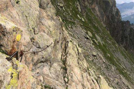
Anyway, it's cool stuff. Like most 3D mapping things, it's probably more interesting to yourself, than to others. For me, I look at these lines and have distinct memories of each line. Above, that purple line through the snowfield? Yup, that's actually a sketchy AF section hiking/trail running. In fact, the least lovable part of my 7-hour meander that day. To you, it's just a purple line on a white field. To me, it's this:

Meanwhile, below at Le Tour is the edge of France and Switzerland, along the black line on the right side. It's sorta the forgotten child of the main Chamonix area, but is honestly my favorite. It's always quiet - tourists don't tend to go there, and I can shoot and test all sorts of products there without anyone poking at me. Those lines below are from GoPro Hero 8 testing and AirDog ADII testing. The Fenix 6 Review Video (with 1.3mil views) was shot with me standing where the 'F' in red is, with the mountains in the background. The Suunto 9 Hands-on video with 334,000 views is where the S is.
But again, to you they're just lines on the grass. French grass, Swiss grass...but still just grass.
Still, it's fun to play around. Go forth and have fun, here's that link again (for Strava Subscribers anyway).
With that - thanks for reading!

